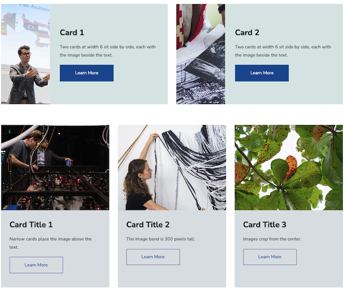
Cards are a simple way to pair an image with text inside a Blade. Place one card across the full row, or line several up side by side. Each card has a width, an optional background color, an optional image, and body text. The settings are minimal, so you can build a row of cards in a few minutes.
Book: For Content Editors
Last Updated:
10/07/2026 - 15:00
Cards
Create a Card Layout
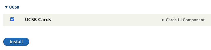
- Enable the module by going to Extend > UCSB Cards > Install.
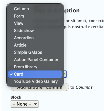
- On your page, add a Blade, then go to Column Type > Card.
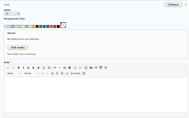
- Choose a Width. The page grid has 12 columns, and the width sets how many of them the card spans. The default is 12, which is the full row.
- Optionally, choose a Background Color from the UCSB palette. On dark colors, the text automatically switches to white so it stays readable.
- Choose an Image from the media library, or upload a new one. This is optional. The image's alternative text comes from the media item, so add or edit the alt text there.
- Enter the Body. This field is required. You can use headings, lists, links and buttons here, just like a regular text area.
- Save.
- To add another card to the same row, select Add Card in the Blade.
Blade Settings
Two settings on the parent Blade change how its cards appear.
- Equal height makes every card in the row as tall as the tallest one. Turn this on when your cards have different amounts of text.
- Full bleed removes the gaps between cards. A full bleed card at width 12 stretches from one edge of the page to the other.
How Cards Lay Out
The width you choose for each card controls where its image appears. On phones, every card stacks.
| Card | Layout |
|---|---|
| Width 6 or wider | The image sits beside the text and matches the text's height. |
| Width 5 or narrower | The image sits above the text in a band 300 pixels tall. |
| Phones | Cards stack, and the image always appears above the text. |
Recommendations
- Cards are not links. To send visitors somewhere, add a link or button inside the Body. If you want an image tile that is fully clickable, use Action Panels or Grid Items instead.
- Images fill their space and are cropped from the center, so choose photos with the subject in the middle. Every card image is at least 300 pixels tall.
- Avoid width 1. It is too narrow to hold readable text.
- Keep the widths in a row adding up to 12 (for example 6 + 6, 4 + 4 + 4 or 8 + 4) so rows look even.
- Use Equal height whenever cards sit side by side so the row looks tidy.
- Not sure which layout to use? See the Cards demo page for examples of full width cards, card combinations and text only cards.