Last Updated: 01/04/2024 - 15:55

Editor Toolbar

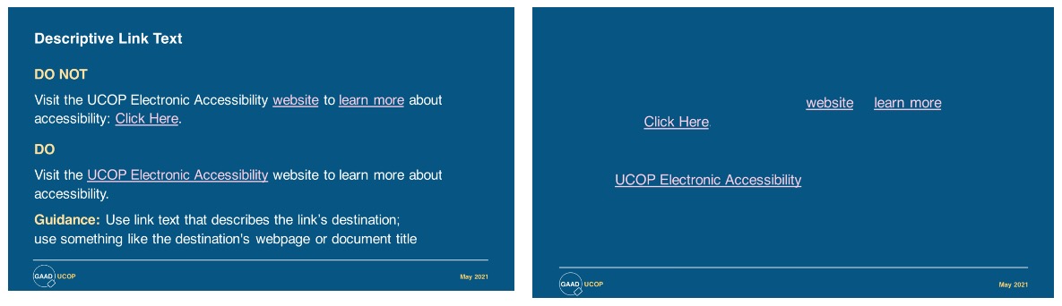
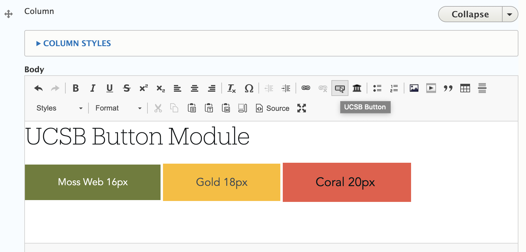
If you are a site builder creating or editing pages, you will notice an editing toolbar within the "Body" section. This toolbar is also commonly known as the WYSIWYG ("What You See Is What You Get") toolbar. The first line includes various editing options that you can use to format your content: bold, tables, bullet lists, links, images, etc. The second row includes Paragraph styles, where you will select a variety of types of Headers or styles for things like captions or lead copy.

Headers

Using headings properly can help in creating a semantic, organized structure to your content, and in allowing site visitors to more easily navigate and read through your website content. If your page content has a lot of sections, each with its own subtitle, you should consider using headings instead of simply applying bold or using CAPITAL LETTERS for your section titles. Checkout some examples of headers on the Styleguide page.

Formatting Text

Alignment is left justified and should remain. If you do center align headers or labels, maintain consistency throughout your section or site by following the same "look and feel." If you would like to format the text to use Produkt instead of Avenir, select "Serif" Paragraph style for any small, medium, or large format. Produkt will not work for a regular H2 or H3 heading. Checkout some examples of formatted text on the Styleguide page.

Tables

Tables allow you to display data in rows and columns. You can create tables on the UCSB Web Theme, and you should make sure that any tables you create are for tabular data, not layout. Multi-columns should be used in favor of table layouts. Tables should be used to display data in rows and columns with proper table headers (column headers, row headers, or both, depending on the type of data). Checkout the tables on the Styleguide page.

Text Links

Links can be internal (pages on your Web Theme), external (other websites), anchor links (or jump links), and attachment links (PDFs). Links can be added to both text and images.  It is recommended to use the "offsite" link when using an external link, which can be obtained through the Paragraph dropdown in the editor toolbar. 

Read more about working with images in the Web Theme

Be sure to give your links unique and descriptive names, which is important for accessibility purposes. Avoid link titles like "click here" and redundant ones like "read more." When adding links to a page, do not use the same link text for two (or more) links if these links go to different places. When possible, choose distinctive titles for pages, topics, and internal and external links. Otherwise, you may end up with identical text in links that go to different destinations.

  1. Create text for link
  2. Highlight the text you want to link and click on the chain symbol in the editor toolbar.
  3. Enter the full url of the link (example: https://ucsb.edu) and select Save.
  4. If the link is external, select the Styles dropdown in the editor toolbar and choose the 'offsite link' which will show a little icon next to the link when the page is saved.


demo of good and bad link text examples

The image titled Descriptive Link Text shows a variety of bad and good links. In the second image, the surrounding text content is removed leaving only the link text. This demonstrates how meaningless nondescriptive link text is for screen reader users.


If you are adding a link to an image in order to make the image clickable, you must also add alt text to that image

Buttons

Buttons are one of the most simple, yet deeply fundamental and foundational building blocks of the web. Click a button, and you submit a form or change the context within the same page. Buttons are for triggering actions. When should you use a button versus a regular text link? Guidelines include:

  • Are you moving to another page or a different part of the same page? Use a Link.
  • Are you building a JavaScript-only powered clickable element? Use a button.
  • Are you submitting a form? Use a submit input button.

On the UCSB Web Theme for Drupal 10, there are two ways to create buttons.

The 'Classic' Style

  1. Create text for link
  2. Highlight the clickable element and click on the chain symbol in the editor toolbar.
  3. Enter the full url of the destination (i.e a pdf file) and select Save.
  4. Highlight the text again, select the Styles dropdown in the editor toolbar and choose one of three button options that appear at the very top:
    classic button choices of three

CKeditor UCSB Button

  1. Place your cursor on the desired area where the button should go.
  2. Select the Button icon from the Editor Toolbar (example below)
    button icon example
  3. Configure the color, size, link text, url.

    button icon settings example


If you don't see the Button Icon in the Editor Toolbar, you'll need to enable it on your site(s).

  1. Go to 'Extend' and enable two modules: CKEditor UCSB Button and Entity Embed
  2. Go to Configuration > Content Authoring > Text Formats & Editors > Full Html > Configure 
  3. Locate the button icon from the 'Available Buttons' section and drag it into the Active Toolbar.
  4. On that same page, go down to the 'Enabled Filters' section. Check the box 'Display embedded entities'. This allows you to preview the button from within the editor toolbar window.