Last Updated: 06/27/2022 - 16:33

Action Panels

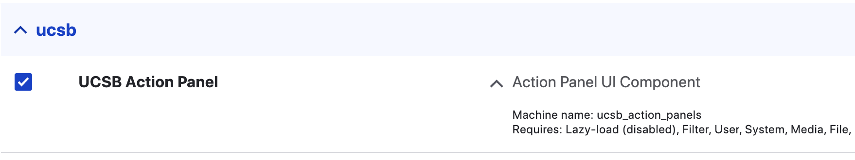
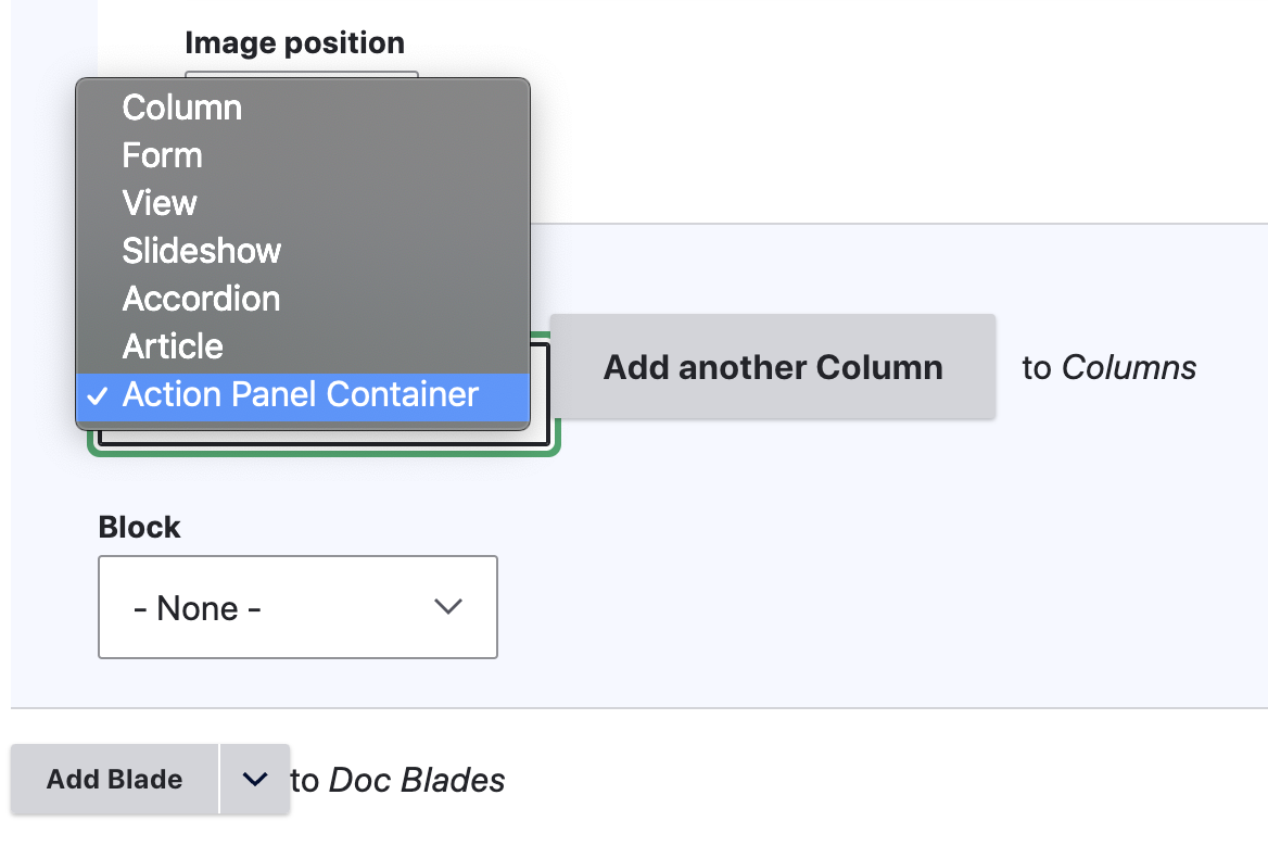
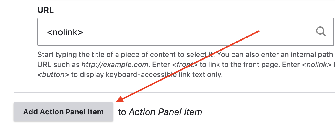
Enhance your website layouts using the Action Panels module. Panel items have the capability to expand in terms of the number of items, and can also appear horizontal or vertical. The settings are very minimal to get you up and running with ease.


Create a Grid Layout

  1. Enable the Module by going to Extend > UCSB Action Panel > Install
    enable action panels module
  2. Inside a Basic Page, go to Column Type > Action Panel Container > Add another Column
    action panel selection example
  3. Select a Panel Overlay Color for the row. If the 'no-color' option is selected, a slightly darkened image will appear. This helps meet the contrast standards with the white font text that appears for the Title.
  4. Choose the orientation - horizontal or vertical. We recommend using horizontal for 1-3 panels total and vertical panels for 3-7 panels. Note: the width of each panel is automatically determined by the number of panels within the blade. 
  5. For each Action Panel Item, enter a Title. This will appear in the center of the panel in white text.
  6. Enter a subtitle. This optional field will only display to visitors when they hover over the panel.
  7. Select an Image. This module uses the Media module for images so there may be a need to upload an image from your computer rather than pull from the site's server. 
  8. Select a URL by typing in the internal page title and selecting a matching page. This will link the entire panel to the URL entered here. We recommend using internal links only but it is possible to enter an external link here. 
  9. Save.
  10. Add another panel item to the blade by selecting 'Add Action Panel Item' 
    action panel add another example

Recommendations

  • Use Action Panels on homepages and landing pages as a way to guide visitors to internal pages you deem important. This will also boost Search Engine Optimization as internal linking is vital for a healthy website.
  • If you are not sure whether to use horizontal or vertical orientation, let the image orientation help determine that. Landscape images, for example, will best fit a horizontal panel. They will work for vertical panels too but the image will get cropped.
  • When enabling this module, only the Basic Page content type adds the Action Panels. It is possible to extend this for use on other content types. 
  • By default the panels are arranged side by side with no gaps between. If you would like gaps in between each panel please contact us for more details. Another similar option (minus the hover effect) is the use of Photo Item Grids.
  • Height for horizontal panels: 300px / height for vertical panels: 720px

Examples


resources undocumented students example page using action panels

intramural sports website showing use of action panels

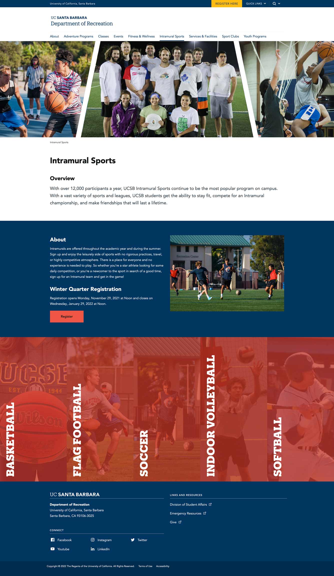
For working demo of different action panels, please checkout our Demo Page