Photo slideshows are a collection of images that a visitor to your site can click/tap through. Slideshows are an excellent way to display information in an organized and compact manner.
Book: For Content Editors
Last Updated:
08/23/2023 - 10:26
Slideshows
Example
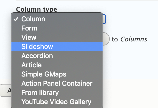
- Inside a blade, you will find access to a dropdown with different 'Column Types' available. Select Slideshow and click Add Another Column.

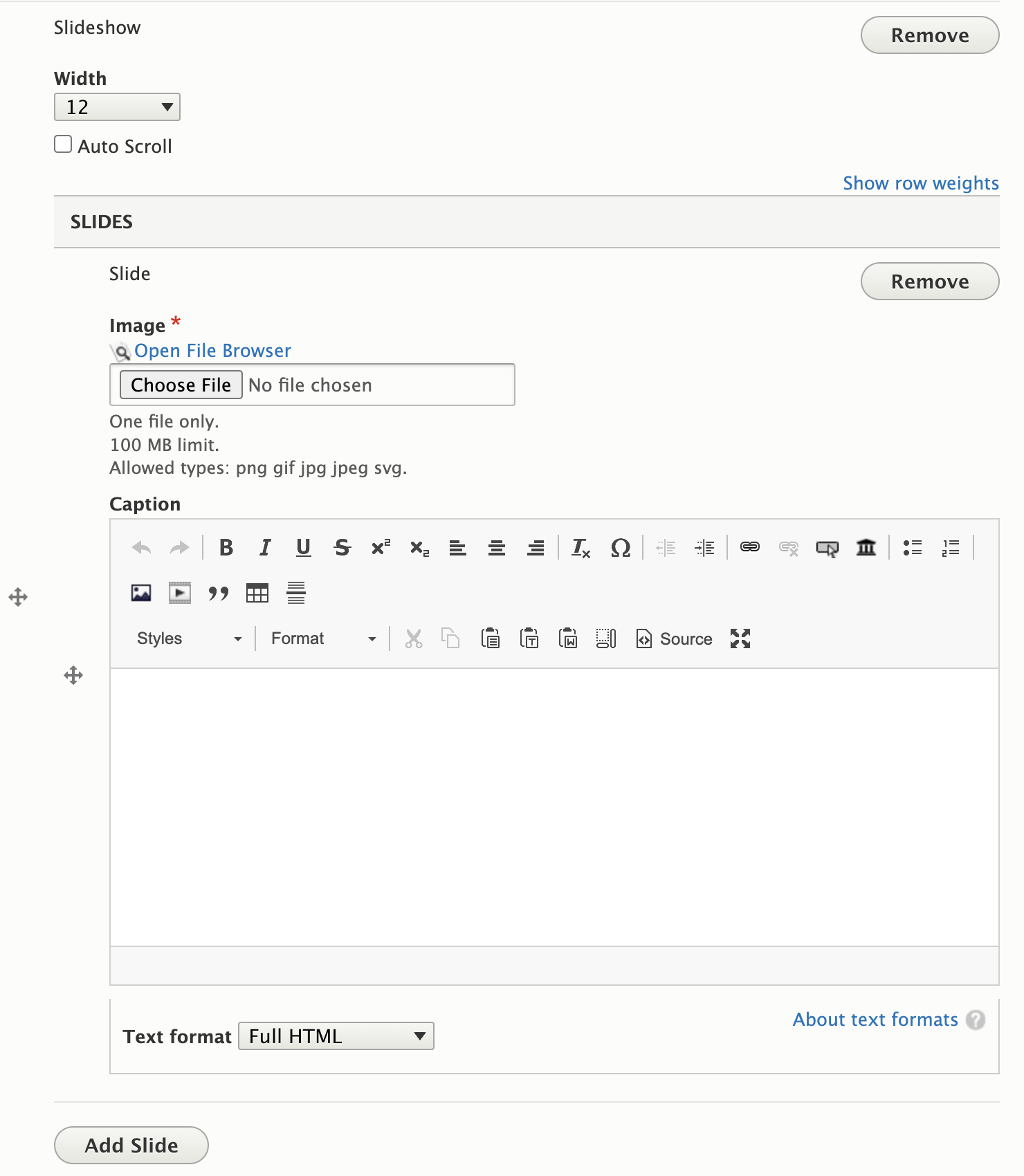
- To add an image, click the Choose File button to access or upload images to your site database or click the Open File Browser link if the image is held on your personal device or other drive. To add additional images, click the Add Slide button. We recommend using in the range of 2-6 images per slideshow.
- Modifying the width will auto adjust the size of the images showing on your page. It is recommended that the images going into your slideshow are all the same exact size. This keeps the slides from moving around when the user clicks/taps the directional arrows.
- Select the "Auto Scroll" checkbox to automatically scroll through the slideshow, versus letting the user click or tap through the images. You don't see the option? Follow these steps to add the field.
- For pixel perfect alignment, be sure the photos in the slideshow have the exact same width and height dimensions.

Best Practices
- Use sliders sparingly. Rotating images can distract visitors from other important content on your pages. The latest user experience data reflects that visibility after the first slide is very low.
- Do not use more than one slideshow on a page.
- Large (high resolution) images may cause performance issues and slow the page speed down.Upload photos that have a file size of 1MB or smaller when using this column type.
- If you are using 4 images for your slider, be sure all 4 are the same exact width and height.
- It is recommended to caption all of your photos, especially if its not obvious what the image represents.
- Ensure the ALT text is meaningful and describes what is happening in the photo, not what the photo is about.

