Last Updated: 03/11/2024 - 09:53

Grid Items

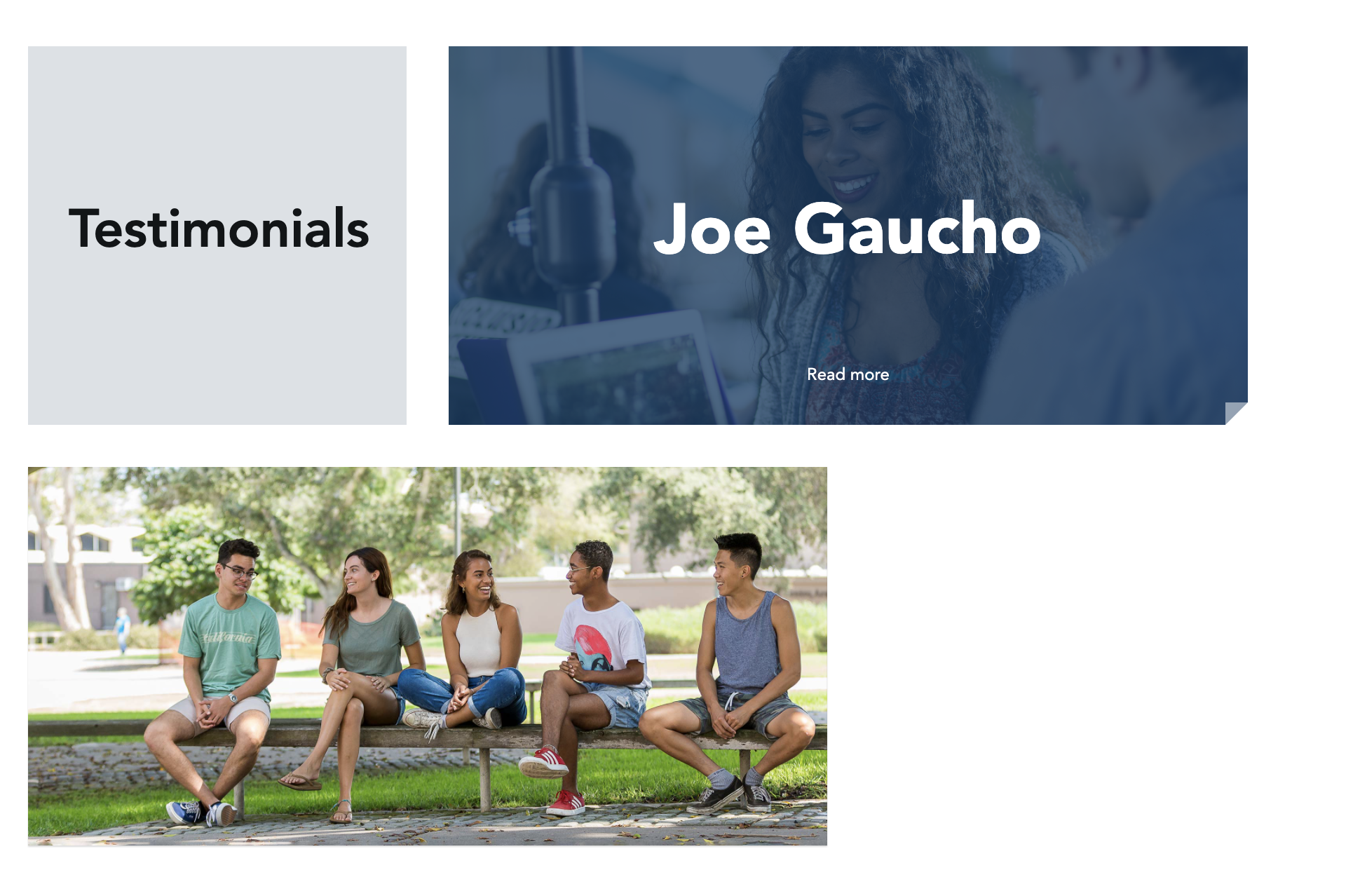
Because you can mix and match items within the grid layout, some interesting results can occur. Do you like masonry style (i.e. Pinterest) layouts? Those are accomplishable with using the grid. Image and text combinations are also an option, as well as grid items with varying dimensions. 

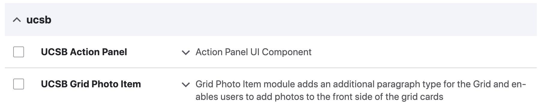
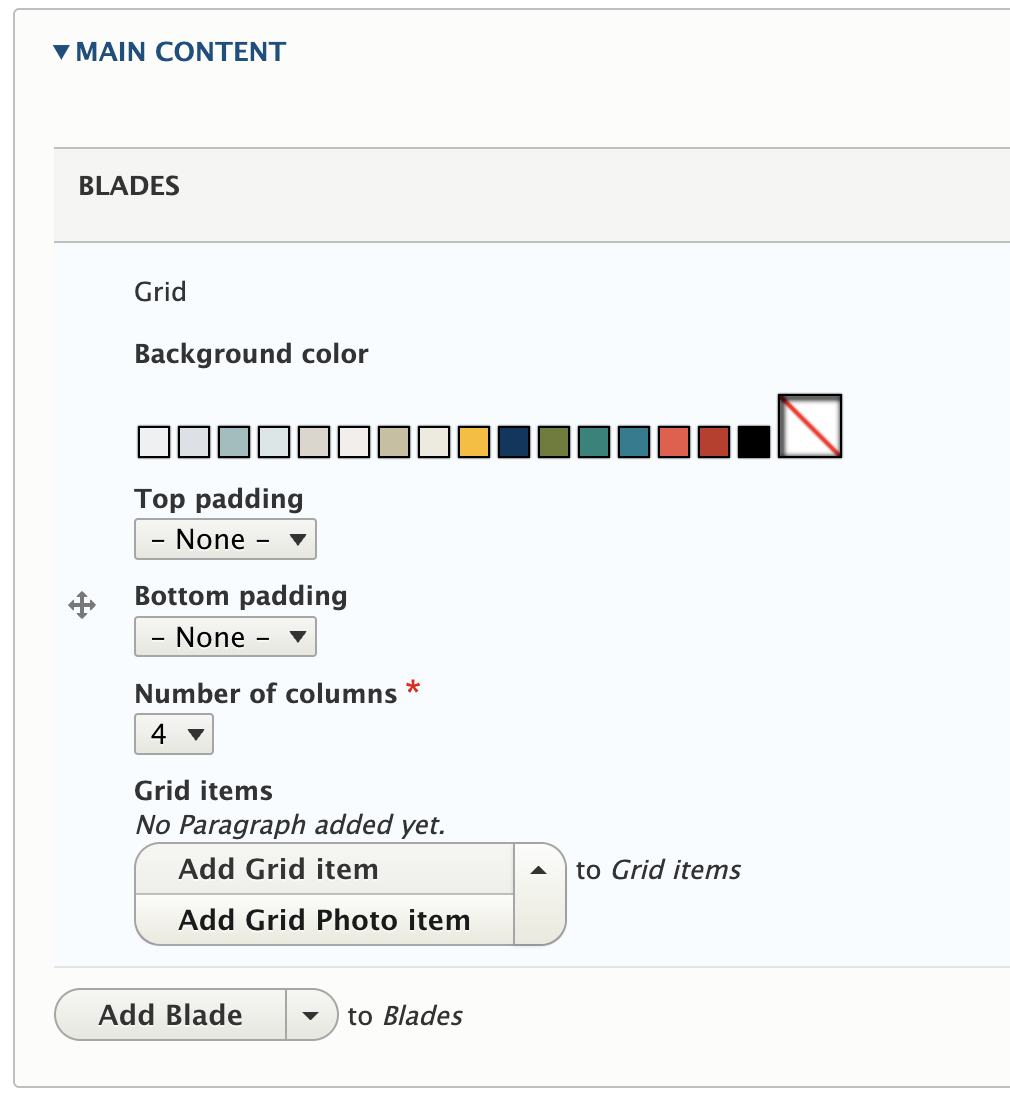
There are two types of Grid Items: Regular Item grids and Photo Item grids. A 'facts and figures' page is a suitable option for the regular grid, and the photo items are great for highlighting a campus event or using subtle background imagery to drive content.

example grids in action

Create a Grid Layout

  1. Enable the Module by going to Extend > UCSB Grid Photo Item > Install
    enable module from modules main page
  2. Inside a Basic Page, go to Main Content > Add Blade dropdown > Add Grid
    step 1 grid layout
  3. A Regular Grid item opens first. If you'd like to add a Photo Item instead, select it from the dropdown.
    step 2 creating grids
  4. Select 3 or 4 columns (required) which will designate the size of each grid square.
  5. Select a Background Color (if desired) and spacing on top and bottom.
  6. Add content to at least the Front if using a Regular Grid item. For Grid Photo, select an image or upload a new image using the 'Add Media' button. 
    step 3 adding a photo grid
  7. Content added to the 'Back' field will feature a 'read more' link at the bottom of the front card. 
  8. Select the Width and Height (1:1)
  9. Add Grid Item
  10. Save or Preview the new Grids to determine the final layout.

Visit the Demo Page to see the grids in action!