Column types are for specific types of content to add to your Blades. When you have created a new Blade you will see an option at the bottom of the blade to select from a Column type dropdown menu.
Book: For Content Editors
Last Updated:
10/05/2022 - 17:56
Grids & Columns
The Web Theme is equipped to make up to 1-12 column rows and provides 4 unique column types. The column types offer additional ways to layout content and will be up to the site builders to determine when and how they are used. Below are some helpful tips:
- Consider landing pages vs. internal pages and if multi-columns are better suited for one or both.
- Switch the order of each row to mix and match your column of rows (alternate the displays)
- Slides in a slideshow do not have a set height value, so it is recommended to crop your slideshow images to be the same width/height before adding them to the blade.
- Avoid using full-width slideshows, especially at the top of an internal page.
Column Types
Form
Build any type of form to collect any type of data, which can be submitted to any application or system.
View
Create, manage, and display lists of content from the available content types.
Slideshow
A slideshow can be used to display text or images that continuously scroll from one slide to the other to display its content.
Accordion
Useful when you want to toggle between hiding and showing large amount of content, such as FAQs.
Action Panels
Build horizontal or vertical image panels using Action Panels. These panels have a smooth hover effect that reveals custom text.
Grid Items
Make a Pinterest-style photo album or group small bits of content together in an interesting way using the two Grid Item options.
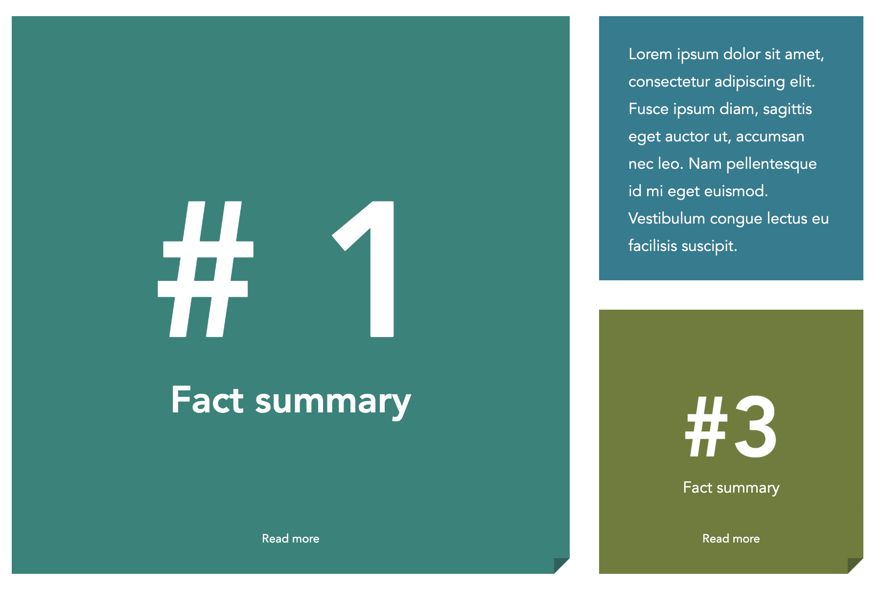
Grid layouts are card-like in design and can flip to reveal additional content. There are many different purposes for this type of layout and we hope you find it flexible enough for your web theme site.
Visit our instructions page to learn how to create grids.