To keep within university brand compliance, we recommend sticking with the following design implementations and not customizing them further.
Book: Get Started Guide
Last Updated:
08/23/2024 - 11:34
What Should Not Change
Utility Bar Design
The utility bar must include:
- The University of California, Santa Barbara link
Header and Column Spacing
The 12 column width with predefined spacing of 15px on each side of the columns is fixed. Styling of the predefined text header spacing and spacing between other elements defined within the web theme styling should not be altered.
Primary Navigation Styling
The simple navigation structure and design is created to work for all device sizes and optimizes the screen real estate.
Footer background color
Footer background must remain navy color with white text
Wordmark in footer
This space is reserved for a UC Santa Barbara branded primary wordmark, available for download via the UC Santa Barbara Visual Identity page.
Sub-Footer Content
The copyright link, terms of use link, and website accessibility link are permanent features for all sites and are required by UC Santa Barbara.
Base Colors and Fonts
Digital color palette
The color palette options are limited to the color swatches defined by the Visual Identity and meet the AA standards for acceptable contrast colors. The color palette is available for the following fields on the back end:
- Title background color
- Overlay Background Color
- Background Color (for blades)
- Border Color (for columns and blades)
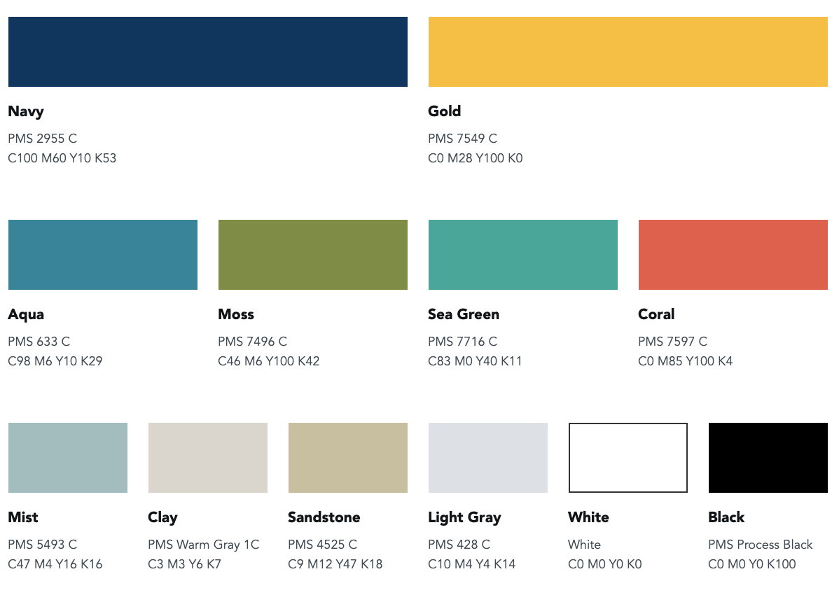
Learn more about the UCSB Digital Color Palette
Link color
The default link color is blue. The color should be modified to ensure enough contrast with background color and meet accessibility guidelines.
Web fonts
The approved web fonts are Nunito Sans (replaced Avenir in August 2024) and Produkt.
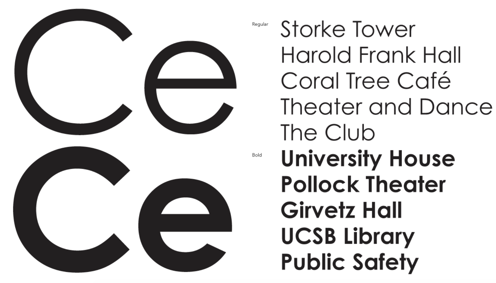
Learn more about UCSB Web Fonts