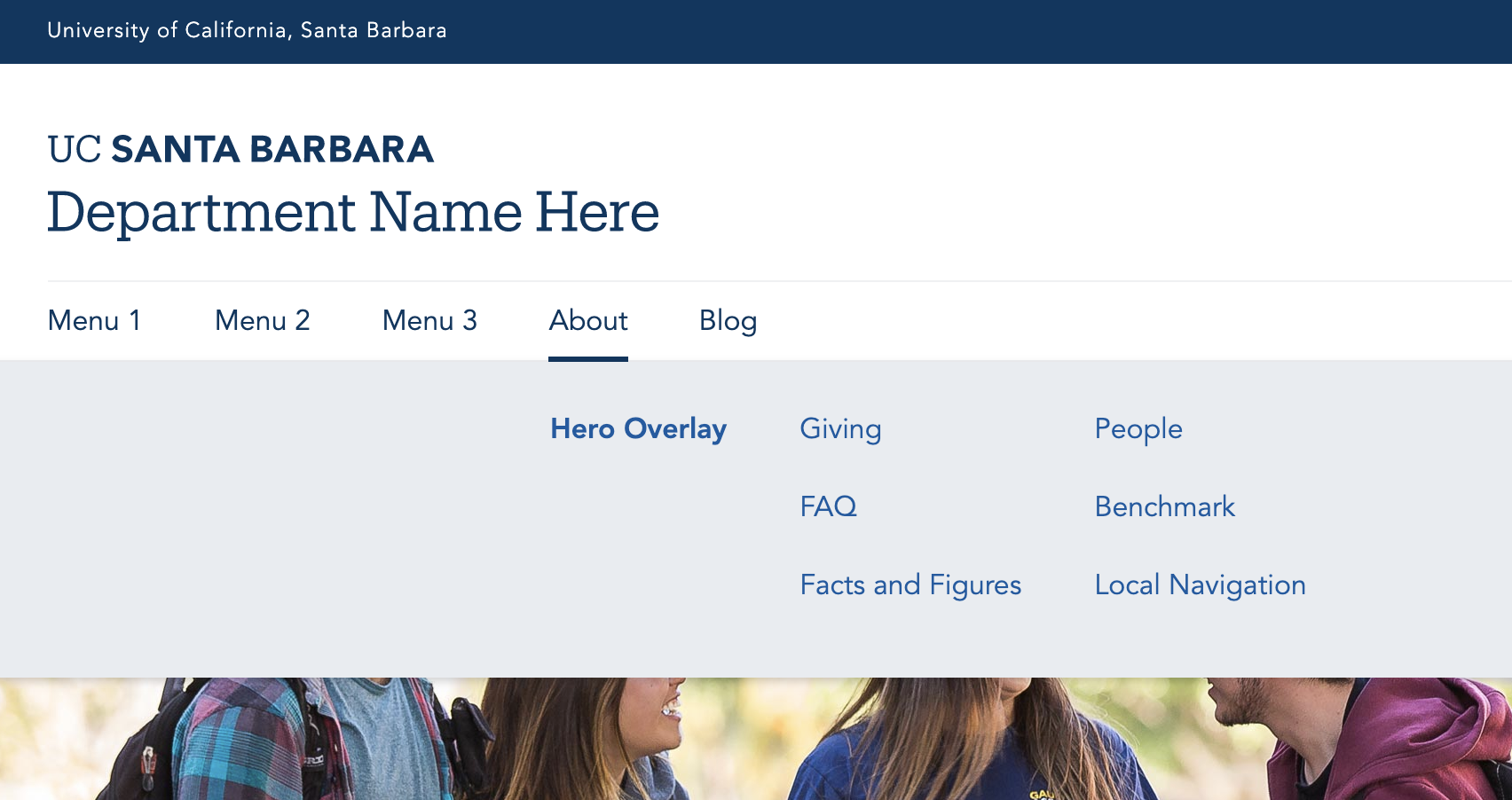
Last Updated: 04/05/2023 - 15:05

Menus, Utility Bar & Footer

You can add, move, or delete content in the main navigation, utility bar, and footer when creating or editing content.

Main Navigation

All menu items in the main menu need a "parent" (top-level) item. For the parent items in the main menu, the main menu itself is the "parent." Additional items are considered "child pages" (sub-pages) of the parent items. Child pages will show up in a local (sidebar) menu from the parent item.

In desktop, only the main menu (level 1) links are displayed. Level 2 links are displayed in a mega menu that take up the entire row.  The first link, usually the landing page or 'Overview', is always separated in its own column. Only Level 1-2 links are displayed in the main navigation.

mega menu sample

Open Mega Menu example, UCSB Web Theme Demo Site 

To get started, the recommended way to add menu items is by creating a basic page. When editing the page, the right hand side of the page includes information about the menu, called 'Menu Setting'. From there, select 'Provide a Menu Link' and create a menu link title (it can be the same as the page title or it can be customized) and then using the 'Parent Link' dropdown, designate the page's placement either as a parent (Level 1) or a child to the parent (Level 2).

Reorder the Menu items

Admin > Structure > Menus

Main navigation > Edit

Toggle the crossbar (left column) or use row weights (right corner)

Secondary Menu

The secondary menu is an optional menu that sites under the main navigation, separated by a block header, and runs across the row across all devices. The purpose of this menu is to lengthen the menu items that can ve displayed, which is normally two (the parent and the child). This extends the menu system one additional level. The number of items in the secondary navigation should be kept to 3-5 items or fewer, especially if there are long menu titles that may wrap at times.

  • If you do not wish to use a Secondary Menu, consider using the "Quick Links" menu instead


Read more about how to make a secondary menu

Utility Bar

Located at the top of your website, the utility bar will allow visitors to quickly access the information they are looking for. It consists of various links that you can add/edit as needed. You can also change the bar color to match your site's color palette. 

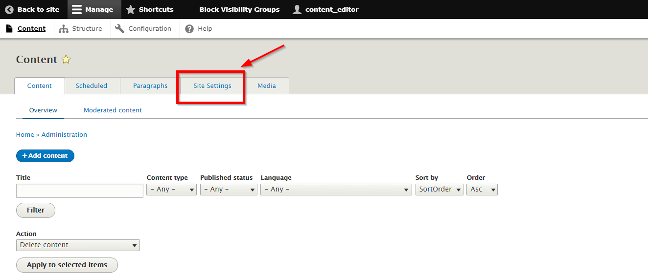
Alter the Utility Bar by going to: Content > Site Settings > Utility bar
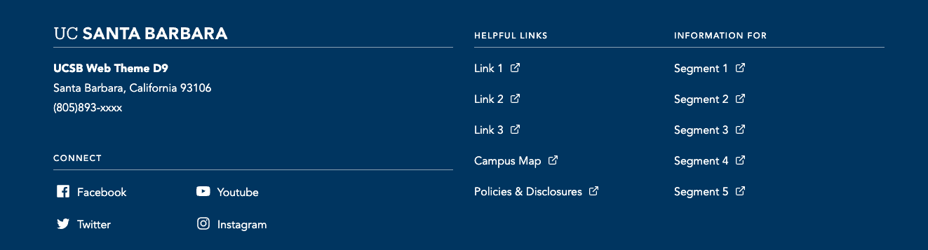
example of where to find the utility bar settings

Quicklinks

The Quick Links menu is an optional menu that will show up in the Utility Bar region and pops open a list of links upon a click. There is no set amount of links you can set but 4-5 is the recommended amount. If you choose not to use this, simply go to the Menu where the links are located and delete each one. If all are removed the Quicklinks Menu will not appear.

  • Structure > Menus > Quicklinks
  • 'Information For' is hard-coded into the Quicklinks Menu and not changeable.

Give Link

You have the option to show/hide the Give link. It should link to the fund of your area on the giving site. Right now the link points the main UC Santa Barbara Give page. Either point to a specific url or hide the link altogether. 

Alter the Give Link by going to: Content > Site Settings > Utility bar
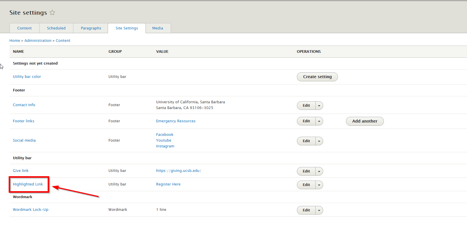
Highlighted Link

This highlighted link section allows you to change the background color to draw visitors' attention.

Highlighted Link screenshot

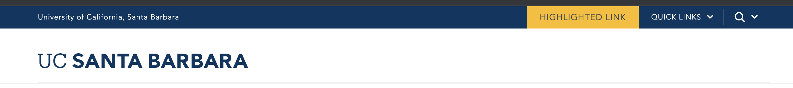
  1. Go to site settings: /admin/content/site-settings
  2. Click the Highlighted link link or the adjacent Edit button (on the right).
  3. Enter the full URL and Link Text in the provided fields

    example of adding a highlighted link


Footer

The footer section contains the contact information, social media, and a list of links that are helpful for your site visitors.

site footer section screenshot

  • Content > Site Settings > Footer Link(s)
  • Social Media Icons 
  • Basic Site Settings for Site Address Info